
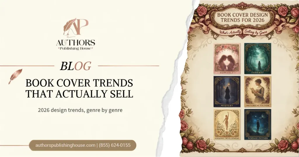
Introduction: The biggest book cover design trends in 2026 are typography treated as the main visual, high contrast color, hand illustrated artwork instead of stock photos, and stripped back minimalism. Which one works for you depends on your genre. Romance and fantasy are moving toward illustrated, saturated covers. Thrillers favor bold condensed type and stark contrast. Nonfiction rewards clear, oversized titles that communicate the reader’s benefit at a glance. Every one of these trends serves the same goal, which is to make a stranger stop scrolling and click within a second or two.
This guide is for authors planning a new cover or refreshing an older one. Use it before you brief a designer, so you can ask for what your genre’s readers actually respond to, not just what looks fashionable.
Quick Summary
Five trends dominate book cover design in 2026. First, typography now carries the structure of the cover instead of decorating it. Second, strong color contrast defines the focal point, and saturated colors that once belonged to romance now appear in thrillers and fantasy too. Third, custom illustration is replacing stock photo collages across romance, fantasy, young adult, and cozy genres. Fourth, minimalism stays strong for thrillers and nonfiction. Fifth, designers build covers to pop as tiny thumbnails while still rewarding a closer look. Through all of it, one rule holds. A cover must signal its genre instantly, because a cover that looks great but sends the wrong genre signal attracts the wrong readers.
Trend 1: Typography Is the Structure, Not the Decoration
Short answer: In 2026, the title and author name are often the main visual element of a cover, sized and styled to carry the design on their own.
Typography now works differently in each genre. Literary fiction leans toward oversized, confident sans serif or clean serif type. Thrillers push bold condensed fonts, and the author name often becomes a brand signal. Fantasy embraces ornate display type, sized large enough to function as artwork. Some designers describe this as maximalist typography, with oversized fonts filling a large share of the cover. This trend also helps self published authors, since strong type needs no expensive illustration to look professional.
Trend 2: Contrast Over Subtlety
Short answer: Designers use strong color contrast to force clarity, so readers can identify the title and focal image even at thumbnail size.
Romance proved years ago that saturated color sells. That lesson has now spread to fantasy, thrillers, and even darker genres, which rely on contrast to build visual hierarchy. This does not mean every cover turns neon. It means designers choose a deliberate light and dark relationship, such as black with a sharp accent color, so the cover reads instantly on a phone screen.
Trend 3: Illustration Replaces Stock Photography
Short answer: Hand drawn and digitally illustrated covers have spread from romance and young adult into nearly every genre, while stock photo mashups fade.
The shift from photographic to illustrated covers is among the biggest changes of the past few years. One cover design source notes that a photographic cover in romance can now read as older or self published, which can hurt sales. Illustration offers another benefit. A custom illustrated cover cannot exist on anyone else’s book, which makes your title more distinctive in a crowded category. Photography still dominates thrillers, though illustrated covers are gaining ground in cozy mystery and psychological thriller.
Trend 4: Minimalism With One Strong Idea
Short answer: Stripped back covers built around a single symbol, a clear title, and generous empty space keep performing for thrillers and nonfiction.
Minimalism works because it reads instantly. A thriller might use a stark silhouette. A nonfiction guide might pair one geometric icon with a bold title. This style suits genres where clarity and credibility matter more than world building. It also suits authors who want a professional look without complex artwork.
Trend 5: Built for Thumbnails, Rewarding Up Close
Short answer: Designers now create covers that stay readable at the size of a phone thumbnail, then add texture and detail that reward readers who look closer.
Most readers meet your cover for the first time as a tiny image in an online store. If the title blurs or the image turns muddy at that size, the cover has failed before anyone sees the details. Test every design at thumbnail size before you approve it. Then look for texture, hidden details, or subtle touches that add depth when a reader zooms in.
Book Cover Trends by Genre
Short answer: Each genre has its own visual language, and the most effective covers follow that language while adding one fresh element.
| Genre | 2026 Cover Direction | Typical Palette |
| Romance | Illustrated characters or objects, florals, playful type | Pastels, blush, soft lavender, or bold pop colors |
| Fantasy and romantasy | Painterly scenes, ornate display type, embossed style florals, maps | Jewel tones, deep purples, gold |
| Thriller and mystery | Bold condensed type, stark silhouettes, warped or blurred text | Black, red, metallics, black with yellow |
| Literary fiction and memoir | Oversized type, abstract or conceptual imagery | Muted, restrained, or monochrome |
| Nonfiction and self help | Oversized title, clean layout, one clear icon, author presence | White space with one bold accent color |
| Gothic and dark fantasy | Ornate detail, moody imagery, ravens or cathedrals | Deep shadows with muted jewel accents |
Each genre has its own visual language, and the most effective covers balance familiar design elements with originality. Before choosing a style, authors should research successful books in their category and examine their color palettes, typography, and imagery. This approach aligns with Reedsy’s guide to book cover design trends, which explains how genre-specific visual cues help covers communicate with the right readers.
Color Psychology Still Matters
A dark, high contrast cover signals suspense or danger. Soft pastels suggest romance or comfort. A clean, structured design implies professionalism, which is why it works so well for business and self help books. Color choices also split into two camps in 2026. One camp uses bright, saturated, high energy palettes. The other uses nearly monochromatic dark palettes, which suit dark romance, thrillers, horror, and literary fiction. Match your palette to the emotion your genre’s readers expect.
Should You Follow Cover Trends?
Short answer: Follow trends only when they match your genre, because a cover that signals the wrong genre attracts the wrong readers, no matter how modern it looks.
Originality matters, but a cover must still communicate genre. A charming hand painted cover may attract the wrong audience if the book is a dark thriller or a formal reference title. What does not change is the foundation. A cover that reads at a glance, speaks its genre, and looks made with real care keeps winning long after this year’s fashions fade. Study the top twenty bestsellers in your category, note what they share, and then decide which single trend to add.
Fiction vs Nonfiction Cover Approaches
Fiction covers should communicate atmosphere and emotional promise, not summarize every event in the story. Nonfiction covers need to communicate the subject and the reader benefit more directly. Many successful nonfiction covers sell the transformation, not just the topic, using oversized type as the main design element. Children’s covers must appeal to both children and the adults who buy for them, and academic titles should look credible, structured, and relevant to the subject.
Common Cover Design Mistakes to Avoid
Many authors copy a trend that does not fit their genre, which confuses readers about what the book is. Others choose fonts that look elegant at full size but turn unreadable as a thumbnail. Some pile too many elements onto one cover, which dilutes the focal point. A fourth mistake is skipping the thumbnail test entirely. A fifth is hiring a designer without sharing comparable covers from your genre, which leaves the designer guessing about your readers’ expectations. A clear brief that includes your genre, your audience, and three to five comparable covers saves time and reduces revisions.
Frequently Asked Questions
What is the biggest book cover trend in 2026?
Typography as the main visual structure is one of the strongest trends. Designers use oversized, confident type that carries the cover design on its own, with different styles for different genres.
Are illustrated covers better than photographic covers?
In romance, young adult, fantasy, and cozy genres, illustrated covers increasingly outperform stock photo covers, and photography can read as dated. Thrillers still rely heavily on photography, though illustrated options are growing.
What colors sell best on book covers in 2026?
High contrast and saturated colors dominate, including neon accents and jewel tones. The best choice depends on genre, such as pastels for romance, black and red for thrillers, and jewel tones for fantasy.
Does minimalism still work for book covers?
Yes. Minimalist covers built around one strong idea keep performing, especially for thrillers and nonfiction, since they read instantly at thumbnail size.
Should I design my own book cover?
You can if your genre uses simple, typography driven layouts, such as business or self help, and you are comfortable with design tools. Hire a professional designer if your genre demands complex illustration or if the book is central to your career.
How do I test whether my cover works?
Shrink it to the size of an online store thumbnail. If the title is still readable and the genre is still obvious, the cover passes the most important test.
Conclusion
Book cover design trends in 2026 point in one clear direction. Covers are getting bolder, clearer, and more distinctive, through typography that carries the design, contrast that survives a thumbnail, and illustration that sets a book apart. The winning approach is not chasing every trend. It is choosing the one that fits your genre, testing it at thumbnail size, and making sure the cover tells readers exactly what kind of book they are about to open. A cover that does this earns the click, and the click is where every sale begins.
